Electrician Company Logo Ideas Applied to Real Apparel Pieces
Quick Answer- Logo ideas that read professional on real electrician apparel.
- Lightning bolt, voltage symbol, wrench-and-wire, retro power line.
- Single-color logos reproduce cleanest across the catalog.
- Placement guide for tee chest, polo, hat, and hoodie.
A great logo is wasted if it does not reproduce well on the apparel. A great logo on the apparel pays for itself across years of brand visibility. Here are working electrician company logo directions, design rules that reproduce across the catalog, and placement guidance for each piece.
Six Logo Direction Concepts for Electrician Companies
- Lightning bolt with company name. Most-used direction. Works as a single-color silhouette and stays recognizable at small scale.
- Stylized voltage symbol. The wavy AC voltage line worked into the wordmark. Clean, professional, modern.
- Plug and prong icon. Simple electrical plug silhouette paired with the company name.
- Wrench and wire crossed. Trade-tool reference, reads as established trades business.
- Retro power line tower silhouette. Industrial heritage feel, works for commercial-focused brands.
- Owner initials in a shield. Family-trade or owner-operator brand. "JD Electric" in a shield mark.
Design Rules That Reproduce on Apparel
- Single-color version required. Every logo needs a working 1-color version (black, white, or company color). Reproduces cleanly across all garments.
- Bold strokes only. Lines thinner than 1/16 inch may not print or embroider cleanly at small scale.
- Avoid gradients. Gradients embroider poorly and print less crisp than solid colors.
- Test at 2-inch scale. If the logo is readable at 2 inches wide, it will read on any apparel piece.
Bear Grips Pro Shops: Custom Apparel for Your Team. No Minimums. Free Shipping.
Logo Placement by Apparel Piece
| Piece | Best placement | Logo size |
|---|
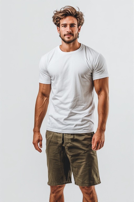
| Tee | Left chest plus full back (logo plus company name and phone) | Chest: 3-4 inch. Back: 10-12 inch. |
| Polo | Left chest only | 2-3 inch embroidered |
| Hoodie | Left chest plus full back | Chest: 3-4 inch. Back: 10-12 inch. |
| Long sleeve | Left chest plus full back, optional sleeve text | Chest: 3-4 inch. Back: 10-12 inch. |
| Quarter-zip | Left chest only | 3-4 inch embroidered |
| Snapback hat | Front panel center | 2-3 inch embroidered |
| Beanie | Cuff front center | 2-3 inch embroidered |
Color and Brand Consistency Across the Apparel Line
- Two brand colors maximum. Most electrician brands use a single primary plus black or white.
- Same logo orientation across all pieces. Logo always reads the same direction, same proportions.
- Same font on back text across pieces. Company name on tee back and hoodie back uses the same font.
- Color consistency on the garment. Pick 2-3 garment colors and stick with them across the line (e.g. black plus heather gray plus charcoal).
Apply Your Logo Across the Apparel Line
One logo, consistent placement, every piece. Single-piece printing, no minimum.
Start Free
Frequently Asked Questions
Should I redesign my logo before launching the apparel program?
If your current logo is dated, has thin lines, or has no single-color version, a refresh is worth it. A $200-$400 freelance refresh pays back many times over.
Can I use a black logo on black tees?
No. Use a white or light-color version on dark garments. Most companies make a 2-color logo system: black logo on light garments, white logo on dark garments.
How big should my back graphic be?
For tees and hoodies, 10-12 inches wide reads from across the parking lot. Smaller (6-8 inch) reads more subtle, larger (12-14) reads like a billboard.
Can I include my phone number prominently on the back?
Yes. Phone number on the back is one of the highest-converting layouts. Bold, readable from 10-15 feet, drives inbound calls.
Brandon HoltService Industry Operator
Brandon owns a regional contracting company and previously ran an HVAC service business. He writes about trade-business branding, crew uniforms, and the apparel decisions service operators make to win local trust.
More articles by Brandon →