Construction Apparel Design Ideas: Logo, Layout, Color, and Theme
Quick Answer- The best construction apparel designs lean on high-contrast logos, clean typography, and simple color palettes.
- Most successful designs use 1-3 colors maximum, even though the catalog supports unlimited colors at no extra cost.
- Themed pieces (event, anniversary, project completion) can layer custom graphics alongside the company logo.
- Photographic prints and four-color gradients rarely work; block lettering and vector logos always work.
The best construction apparel designs are the ones that read from across the jobsite. High-contrast logos, clean block typography, and one to three colors. The catalog supports unlimited colors and full-color photographic prints, but the designs that survive across washes, fabric colors, and lighting conditions are the simpler ones. Here are design directions that work.
The Logo-First Design Approach
The most reliable construction apparel design is the company logo, full stop. No tagline, no event graphic, no fancy layout. Just the logo:
- Left chest small logo: 3-4 inches, embroidered or screen printed. Looks polished on polos, quarter-zips, and lifestyle pieces.
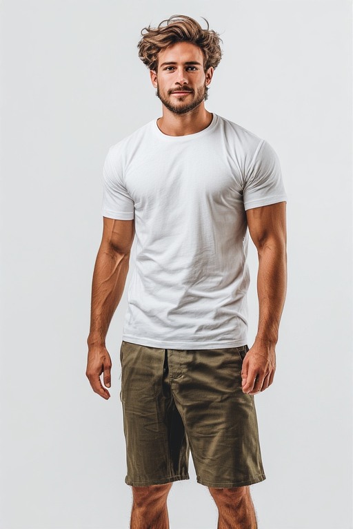
- Full chest large logo: 10-12 inches, screen printed. Reads from across the jobsite on tees and hoodies.
- Full back large logo: 10-12 inches with company name and phone number. Highest visibility for road work and public-facing sites.
For a GC just getting started, run the logo-first design across the full catalog and add themed pieces later. The logo-only approach is the cleanest baseline.
Color Combination Recipes That Always Work
- White logo on black shirt: Highest contrast, most universal. Works in any context.
- Black logo on white shirt: Classic clean look. Shows dirt fast on jobsites though.
- Yellow logo on navy shirt: High visibility, looks professional, photographs well.
- White logo on safety yellow shirt: Brand visibility with safety-color presence.
- Black logo on heather gray shirt: Versatile, hides dirt, photographs well.
- White logo on forest green shirt: Outdoor-brand feel, works for residential GCs and landscape-adjacent contractors.
- White logo on charcoal shirt: Modern, professional, slimming.
Avoid: dark logos on dark shirts, light logos on light shirts, low-contrast pairings, and four-color gradient logos that lose detail at distance.
Bear Grips Pro Shops: Custom Apparel for Your Team. No Minimums. Free Shipping.
Themed Design Ideas Beyond the Logo
- Project completion tee: Project name, address, completion date alongside the company logo. Handed out at the ribbon cutting.
- Topping-out party tee: "Topped Out [Project Name] [Date]" with the company logo. Worn at the topping-out lunch.
- Company anniversary tee: "[Company Name] [Number] Years" with the founding year. Handed out at the anniversary event.
- Crew identity tee: "[Crew Name] Crew" with crew member names on the back. For close-knit framing or roofing crews.
- Trade-specific identity: "Framing Crew," "Finish Carpentry," "Roofing Crew" with the company logo. Identifies sub-trades on multi-crew sites.
- Safety milestone tee: "[Number] Days Injury-Free" with the company logo. Celebration of safety milestones.
- Apprentice graduation: "Journeyman Class of [Year]" with the company logo for apprentices who completed their program.
Themed pieces work as one-time special-edition runs. The shop holds the company logo permanently and adds the themed graphic for that specific run.
Typography Guidelines for Construction Apparel
- Block letters work best: Bold sans-serif or slab-serif fonts read at distance and survive across washes.
- All caps for company name: Reads clean and authoritative, common across construction branding.
- Stencil fonts and military-style: Popular for residential GCs and design-build outfits that want a rugged feel.
- Avoid script and decorative fonts: They lose readability at distance and on small-size apparel like caps.
- Avoid thin sans-serif: They disappear on dark fabrics and read poorly across multiple wash cycles.
For company name displayed under or around the logo, stick with bold or extra-bold weights. Thin fonts do not survive jobsite use visually.
Common Construction Apparel Design Mistakes to Avoid
- Putting too much text on the shirt: Company name + tagline + phone + website + social handles + project tagline. Pick two, drop the rest.
- Four-color photographic prints: They look great on a desktop monitor and fade fast on a tee. Stick to vector logos and block text.
- Tiny logos that disappear at distance: A left-chest embroidered logo at 2 inches reads as a smudge from 20 feet away. Go 3.5-4 inches minimum.
- Mismatched colors across the apparel program: Tees in one shade of navy, polos in another. Pick the exact brand-color hex once and stick with it across every piece.
- Designing for the photographer, not the wearer: A design that looks great in marketing photos but feels weird to wear daily fails. Crew apparel needs to be wearable first.
For Done-For-You VIP customers, a shop advisor reviews the design directions and flags these mistakes before any production run.
Run Your Design Ideas on Real Apparel
Upload your logo, pick the apparel, run a one-piece sample. Validate the design before scaling. No minimum, no setup fees, free US shipping.
Start Free
Frequently Asked Questions
Can the shop create a logo from scratch if we do not have one?
No. The shop applies an existing logo to apparel. For logo creation, hire a freelance graphic designer or a brand design agency. Once the logo is finalized as a vector file, upload it to the shop and run it across every piece. The logo design is a one-time investment that feeds every future apparel order.
How many colors should a construction logo have?
One to three colors is the sweet spot. The all-inclusive base price covers full-color decoration, so there is no cost reason to limit colors. The visual reason is that simpler logos read at distance, survive wash cycles better, and translate across fabric colors more reliably than complex multicolor logos.
Can custom artwork be combined with the company logo on the same shirt?
Yes. The shop supports combining the company logo (small, left chest or sleeve) with a larger custom artwork (full chest or back). Common for event apparel like topping-out tees and ribbon-cutting commemoratives.
What apparel design works best for marketing photos?
Branded polos in navy, charcoal, or forest green with a white embroidered logo. These photograph well in marketing materials, look professional in client testimonial videos, and translate cleanly to social media without lighting fixes.
Brandon HoltService Industry Operator
Brandon owns a regional contracting company and previously ran an HVAC service business. He writes about trade-business branding, crew uniforms, and the apparel decisions service operators make to win local trust.
More articles by Brandon →